Patterns that at worst cost you time and patience: the unsubscribe link you can’t find, the pre-ticked box. On guard there’s a bumbling henchman, the villain with a soft heart: think Gru from Despicable Me.
★ Article · UX · UI patterns
Dark patterns are not all equal: there’s the prank, and there’s the machine built to make you leave money behind. So I built myself an instrument to measure them, and to know where to stop.
Ever tried to unsubscribe from a newsletter and failed to find the link, when subscribing had taken one click? Ever bought a flight with “only 2 seats left at this price” stamped on it, only to find the same seats still there a week later? Ever turned down a discount by clicking a button that said “No thanks, I’d rather pay more”?
Well then, you’ve already been around the dark side. That’s what dark patterns are: design tricks that exploit the haste, the habits and the distractions of whoever is using an interface, steering them toward a choice they would not have made with a clear head. They don’t rob you: they talk you into signing. And that’s exactly where things get slippery.
These days the proper term would be a different one: Harry Brignull, who christened dark patterns back in 2010, has for some time preferred to call them Deceptive Patterns. A more precise name, better suited to official documents, and no doubt more correct.
But I’m attached to the old one. The dark side has a charm that precision can’t repay: it tells of a discipline that can be practised for good or for ill, and of designers who can give in to it a little at a time, almost without noticing.
Like in the sagas we all know, Star Wars first among them: nobody is born on the dark side, you get there in small steps.
As you’ll see further down, I’m not speaking from hearsay.
Dark patterns, as I was saying, are not all equal. There’s the prank that wastes two minutes of your time, and there’s the machine built to make you leave money behind: throwing them all in the same pot helps nobody — not the people trying to defend themselves, not the designers who need to know where the line runs.
So I built myself a measuring device which, in a great feat of imagination, I named the Darkometer: a scale from 1 to 9, where 1 is almost entirely harmless and 9 is the diabolical embodiment of evil. Three zones, three guardians.
The Darkometer: a 1-to-9 scale, three zones, three guardians
Patterns that at worst cost you time and patience: the unsubscribe link you can’t find, the pre-ticked box. On guard there’s a bumbling henchman, the villain with a soft heart: think Gru from Despicable Me.
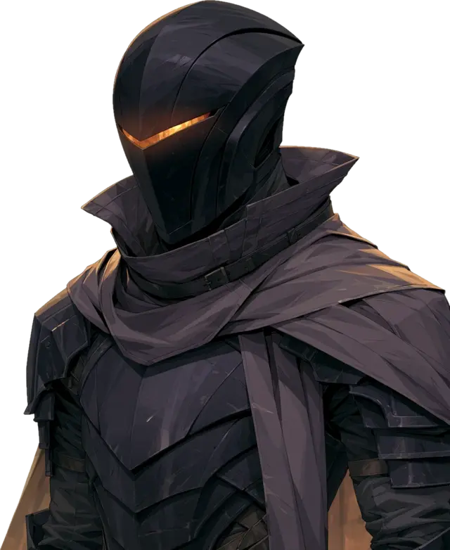
Here the damage gets concrete, even if not severe: steered choices that lock up your money or make you spend more than you planned. It’s also the zone I run into most often. On guard, a dark lord, helm and cape: the famous tenant is Darth Vader.
The territory of patterns built on purpose to cause economic damage, or damage of equal weight. On guard, a shadow demon: past this point cunning is over, the intent is diabolical. You want the famous reference? Sauron.
One note on this last zone, and it’s almost a consolation: it is sparsely populated. Patterns this serious sit so far over the line that they rarely grow old: users get furious, the press writes about them, the authorities arrive. The far end of the dark side is a terrible investment.
One thing needs saying without dancing around it: behind every dark pattern there is no evil algorithm, there is a UX designer practising the discipline in an unethical way. Knowingly, or not. And more than once, too. Since I don’t like preaching from above, let me tell you about one of the times the designer was me.
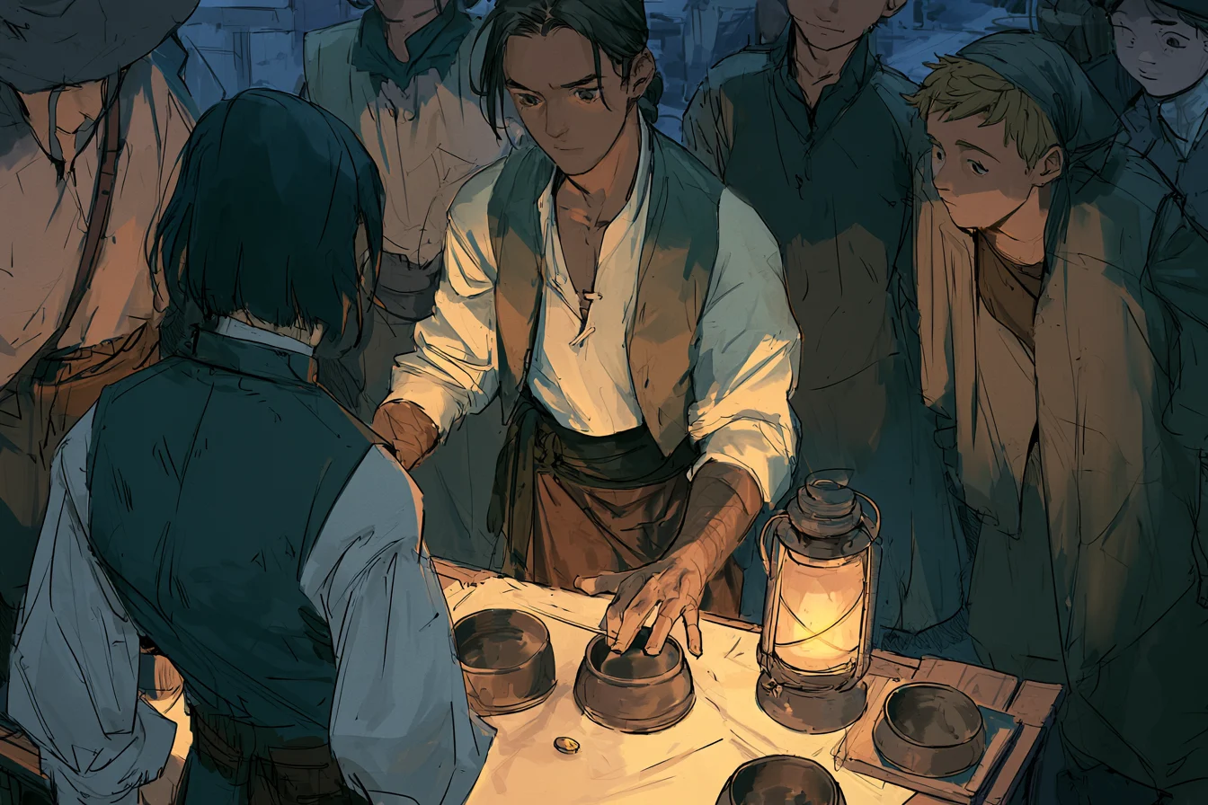
A while back, on our ticketing service, the shop window showed the base price of the tickets; the extra fees only appeared at the last step of the checkout. Clearly stated, mind you. But the total the customer had worked out in their head got overturned at the very end, one step from the till.
The intent, if we can call it that, was innocent: don’t scare customers away by showing the full price upfront. No scheming, no strategy; it even felt like a favour. The effect was the exact opposite: the surprise sent them into a rage, and put them off more than any full price ever would. On the Darkometer, a solid level 3.
My confession, measured: level 3, still the henchman’s zone — by a whisker
We fixed it in the most trivial way in the world: prices in the clear from the very first step, no surprises at the till. And I took home the lesson the Darkometer would later make explicit: you don’t always enter the dark side with bad intentions. Sometimes you slide into it, convinced, on top of everything, that you’re doing your customer a favour.
Which leaves the question this instrument exists to answer: where is the threshold you must not cross?
In the absence of written rules, everyone answers with their own sensibility. Here is how I drew my line: knowingly, I never go past the henchman’s zone. Practices up to level 3 I consider comparable to those of neighbouring disciplines, like marketing when it leans on cognitive biases to sell: not exactly innocent, but widely tolerated. Everything above forces me to settle accounts with my conscience. And I have no intention of being remembered for a dishonest button, even when that button breaks no law.
Requests well past that threshold have reached me, more than once. Almost every time I got by without playing the preacher: it was enough to line up the long-term downsides, because trust takes years to build and one pattern to burn. It doesn’t always go that way, and it doesn’t go that way for everyone: which is exactly why I needed a line drawn beforehand, not an opinion improvised under pressure.
From now on, whenever I put a real case under the lens on these pages, you’ll find its measure too: level such-and-such on the Darkometer, zone of competence.

What about you? Where does your line run? And have you ever realised you’d crossed it only after the fact?